Tuesday, 9 November 2010

RESEARCH: Front Cover Analysis


Both Kerrang! and Xfactor magazine have a continuous colour scheme and font. Kerrang! uses the colours white, yellow and black give a rock type atmosphere. The font used has sharp edges and is very bold which may portray the audience of the magazine. Xfactor use a hot pink, black anf white colour scheme to give it a slightly more feminine look.

The generic music convention codes employed by Kerrang! magazine suggest the target audience are young (15-30 year olds), mostly male, people interested in rock. These people are the alternatives, they do not listen to pop (popular) music like most people do and are rebellious and different. This is why not only the masthead but the staplines are in distorted  and different font. The font has a broken and shattered look which gives a sense of movement which goes well with the masthead of the magazine, Kerrang! as this word is very onomatopeic as a kerrang sound is the sound that would be made when struming a guitar, whereas the masthead of the Xfactor magazine is the very well known logo of the Xfactor TV show. Xfactor magazine appeals more to a very young (8-15 year old) audience that watch the very popular TV programme The XFactor and are interested in pop and very current music. These people are mainstreamers who like to follow trends and be current. This magazine also uses onomatopeia in the language used. The onomatopeia used in both magazines gives the magazines a sense of movement and excitement to engage the reader and give the magazine a lively atmosphere.

The main image of Kerrang! is a low angle, midshot picture of a male playing a guitar and facing away from the camera and at the guitar. The picture being of a male is what tells us it is targeted at a male audience. A male will buy this magazine as they might aspire to be like him or look up to him, this is why the image is a low-angle shot so that the audience will literally look up to him. Also the man looking at the guitar instead of the camera shows us that the magazine is all about the music as even in the photo the focus is on the music.

The main image in Xfactor magazine is a close-up of the 4 judges of Xfactor the TV programme. The picture of the judge, Cheryl Cole is the biggest picture and as it is a close-up this tells us that she herself is the main focus.

The language used on both Xfactor and Kerrang! magazine covers are short an snappy. They consist of very simple sentences and onomatopeia. This is because when the reader buys a magazine they don't want to spend all there time reading long essays when deciding what magazine to buy. They want to know what they are going to buy in as little amount of time as possible.

Wednesday, 3 November 2010

PRELIMINARY: Flat Plan & Electronic media used

There were several different types of media and eletronic devices I used when creating my cover and contents page.

I first used a program called Photoshop on an iMac computer to create things like my masthead, sudheading and other things. It is a very sophisticated program used to edit, create and design things such as photos, drawings, animations and many other things.

I also used a digital camera to take all of the photos on my cover and contents page so that I would have my own original pictures and photos rather than using copyrighted photos or photos from the internet. For the picture on my magazine cover I added special effects from Photoshop to give more of an artsy look and feel to the magazine.

Using a program called iPhoto I was able to transfer my pictures on the digital camera to the computer and save them to the computer inorder to import photos onto my magazine cover.


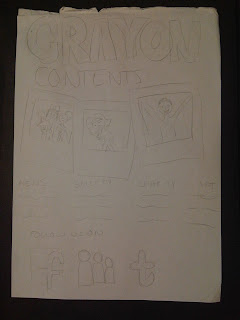
FLAT PLAN
Before even beginning to start my preliminary task on the computer I made a rough sketch of a flat plan
 of my magazine to help me get started with my magazine.
I began with my front cover of the magazine and used several convention of magazines which I found out about in my research and applied it to my front cover and used a mid-shot image  of someone painting something as this is related to art. I then went on to my contents page and then my double page spread.


Tuesday, 2 November 2010

RESEARCH: Masthead research

I then began to look into the mastheads of the magazines.


This masthead is aimed at people 15+ interested in rock music. It is not for your average mainstreamer, this is targeted at alternatives. The writing is very bold, big and has very sharp corners. This may suggest that the readers of this magazine are quite bold and sharp people.


In my opinion I think that the masthead of this magazine is targeted at young girls aged between 8 and 14 year of age. The vibrant and bright colour suggests that is it for children and young people. The colour pink especially has connotations of femininity. Also the font of this magazine is very bubbly with rounded egdes. This is to make the masthead seem soft an more girly.


This masthead is very simple. I think that it gives the impression the magazine is quite serious and based on the artists music rather than gossip about what te artist did last weekend with their new girlfriend. This masthead doesn't particularly seem like it is targeted at a specific gender and its age group is quite broad compared to magazines such as Top of the Pops.


The masthead of this magazine changes very regularly and frequently. In different issues the masthead will be different colours, red, blue, yellow etc. Sometimes the masthead will have a shadow, somtimes it won't. Other times it will slightly 3D and alost coming off the page and other times it won't. At times the main image will be behind the masthead and other times it will be infront. I think this may be to show the diversity of magazine and to show the readers that they are not just wasting their money on buying the same thing they bought last week. It makes the reader feel that this weeks issue is full of fresh and new things.


This masthead is a simple black backbground and white  coloured font. This font is slightly distorted and has slashes in it. This probably to give the masthead a sense of movement and to make it seem exciting and different. Slashes make it seems more dangerous and rebellious for its young teenage readers.