Thursday, 6 January 2011

EVALUATION: Looking back at your preliminary task, of designing the front page of a school magazine, what do you feel you have learnt in the progession from it to the full product ?

Looking at my preliminary task and my actual magazine you can obviously see there is a very significant difference in the quality and quanity of my work. Everything is different.

PHOTOGRAPHY
When doing my font page for my preliminary I thought lighhing alot and even used the rule of thirds when taking this photo to make a nicely balanced photograph thats easy on eyes.
In my image used in my real magazine i coped it alot because i felt it hade excess space and to fit the rule of thirds also but I think that my photo in my actual magazine speaks to my audience more and is more relatable whereas the image in the preliminary task did kind of relate to my audence but was quite boring. I prefer the way the you can see the facial expressions of the girl in the photograph on the right rather than not even being able to see the persons face in the photo on the left.

MASTHEAD

The mastheads from both magazines are quite simular. I made these mastheads both read but for different reasons. I made the masthead from CRAYON red because I wanted to use the primary colours as it was an arts magazine. However the masthead of PLAY is red because it is a bold, bright and vibrant colour. It stands out and my readers would notice it. Red also reflected the personalities of my readers becausethey probably also be bold, bright, vibrant and out-going people.


CONTENTS PAGE && LAYOUT

When creating the contents page for my arts magazine I wanted it to be wacky and colourful to reflect my readers and what the arts is like, exciting and different. However after looking into magazines more and doing my research into existing magazines and found that it looked more professional and better to layout my conents page neaty as it was more organised and my audience wold be able to read the contents page better and find things in the magazine easily.

EVALUATION: What kind of institution might distribute your music magazine and why ?

My magazine will be big and i think that it would be up there with the best of the music magazine industry. I think my magazine should sold in the places where music  mags like Q, Kerrang, Top of the pops and NME are sold. These are places such as:

Newsagents
Small corner shopa and news agents usually sell quite a few magazines and shoud have their own section of magazines. This is most likely where an average PLAY reader would purchase a copy of their magazine as these small stores are very convenient and should be atleast 1 within a 5minute walking distance of your house.


Bigger stores
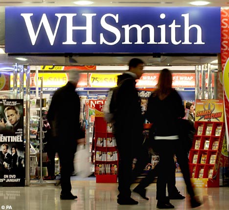
These are places such as WHSmith which sell very large amounts of a wide range of magazines. This includes music magazines and will also include my magazine.  My readers will also come here, although it is not as close to home as a newsagents, because threy are a well known and trusted chain and if there is a WHSmith or store like this nearby then my reraders will probably buy from here.


Grocery Stores
Food Shoppping places such as Tesco and Morrisons also distribute large numbers of magazines. They have very big magazine sections in their stores. This may also by somewhere whewre my readers may purchase their copies pf PLAY because although my readers are not the people that normally do the food shopping, everyone goes to the grocery store now and again. Also theyare beginning open alot of Sainsbury's locals and Tesco expresses around local areas. They are very convenient store which are smaller version of the big grocery stores. There should be one of these within a 10min walk from your house and these places are also a very likely place where my readers would buy my magazine.

Online
This would be where existing magazine/book websites would publish, advertise and sell my magazine. This wll help me alot because my magazine is aimed at a younger generation and they are most likely to use theinternet alot and purchase things off the internet. This wsill also encourage my readers to subcribe to my magazine which will make me more money.

Wednesday, 5 January 2011

EVALUATION: Who would be the audience for your music publication ?

My magazine is a urban music magazine. It is a fun, colloquial and relaxed magazine aimed ate people who listen to urban music. For example

  • Hip-hop
  • Rap
  • Garage
  • R&B
  • Dubstep
There will be several types of article found in my music magazine. Play is a music magazine used for surviellance and socialbilty. It is a magazine in which readers will pick up and buy to be informed about urban music and whats going on in the music industry. Things such as:
  • The Charts
  • Music Awards
  • New Brands/Musicians
  • Upcoming Events and Tours in the UK
  • New Albums - Release dates etc.
  • Music reviews
My magazine will also includes other more gossipy type articles but not too gossip as I would want my magazine to be seen as a serious music magazine not a gossip mag. I will also include other things that I think my reader would be interested in and over comment features of a music magazine. For example:
  • Features about artists - music and their lives
  • Freebies and prizes to win
  • Games and fun - quizzes etc.
  • Letters form readers
My reader will most likely be people from the age of 16+ for both a male and female audience. My target audience will also most probably be of lower or middle social economic class and earn quite decent income so I will make the adverts in my magazine appropriate for the income of my target audience. I will have adertisement for either more unisex items or just as such adverts aimed at females and their is for males.
My audience are most likely to listen to music on TV music channels, video player websites, downloads on iPods, phones etc. so these are the product that will be likely be advertised. They would also spend their money not just on music, and the electronical devices to listen to that music, they would spend their money on clothes, shoes and jewellery as they would aspire to be like the people featured in the magazine.

EVALUATION: How did you attract/ address the audience for your music publication ?

To answer this question I would have to first look back to the previous question, Who would be the audience for my magazine?
The mode of address of my magazine is very light, relaxed and slangish language such as 'cop' (meaning to get/purchase). Not too much slang that you can't read it properly but enough to make the magazine looking more colloquial and less like a boring magazine. If there are any words or phrases that you werent able to understand please visit here.
My pictures was a nother things I used to attract my target audience. This picture is of a girl that would be around and about the age of someone who would read this magazine. She in looking up into the light and is relaxed and happy. It is a low-abgle shot so that the readers are not only looking up to her and aspiring to be like but also literally looking up at her

 In this picture I have made the main focus about the woman and her body. I have tried make her look very beautiful, elegant and classy using the lighting so that femle reader will look at her and think "wow". I also wanted the picture to have alot of sex appeal to draw in the male dreaders too. this is why the picture is taken from the back, so that the focus is more on her bum and have had the model wear a short dress and heels to elongate her legs. I did this in a very nice, tasteful, discrete and classy way because everyone knows that sex sells but it is very important not to go overboard. It should be sexy to attract the male audience but classy to make surenot to repell the female audience.

Here I have used artifical light but tried to make it look more natural bymaking the light softer. The light is shining down on her and she is  wearing very smart clothes and is sitting in a very dominate position. This is all done to show that she is a 'boss' and is a very powerful woman in the music industry
I also attract my audience with the colours, fonts and layouts used in my magazine. I talk in more detail about these things when I talk about creating and the process of making the magazine.I also go into more detail about the photographs too.

EVALUATION: In what ways does my music magazine use, develop or challenge forms and conventions of existing music magazines ?


 As the genre that I chose for my music magazine to be was urban I mainly used and developed ideas and conventions of the magazine Vibe as I had already looked into this magazine quite a bit in my Masthead research and this is a very successful and well known urban music magazine. When creating my front cover for my magazine I looked at Vibe magazine for alot of my inspiration and use different features on the front cover of Vibe mags on my own front cover, especially the layout, positioning and font choices. Vibe front covers are very varied and different with every magazine issue. I mainly focussed on this magazine cover. I really liked this one because it had Keyshia Cole on the front who is one of my favourite musicians.

I also chose a 2 colour colour scheme. I liked the read from Vibe so i chose that however decided to use black as the other colour as I felt llike it went well with my photograph and gives my mag more of an urban and street look to it. I made names of artists in big also because it wil capture my reader attention if they see the name of their favourite artists on the front of the mag.

On this particular Vibe front cover the number is written in a huge font, about the size of the masthead. I used this also in my magazine. I also shaped the text around the number as done in Vibe.

EVALUATION: Audience Feedback


I ask a few different people who were the rough age of my target audience about my magazine in order to get some audience feedback and asked them what they thought about elements of my magazine.

Wednesday, 8 December 2010

CREATING MAGAZINE: Process and evaluation

I have decided to make a magazine in the genre of urban music. Music such as:
  • Hip-Hop
  • Rap
  • R&B
  • Grime
  • Dubstep
Here is a presentation showing he process in which I took to create my musica magazine front cover and contents page:

PLANNING: Sketch of Flat Plan


Before starting on my magazine I brainstormed ideas about the genre and purpose of which I wanted my magazine to be and have. Here are two pictures od the brainstorms and initial ideas that I had.


After that I then sketched a flat plan of my magazine

THE FRONT COVER

This is a midshot of a girl smiling with her eyes closed and chin laying in her hands. I used bold text and added a logo, heading and other smaller photos. The body language of the girl shows that she is calm and relax. It looks as if she is happy and off in her own world dreaming.
 
THE CONTENTS PAGE

I put an editorial in as it is a common feature to have in a magazine contents page. I wrote in collums when putting in the features of the magazine and page numbers as magazines almost always write in collums. A mid-long shot of a girl holding a microphone and singing, this is appropriate as it is a music magazine

Tuesday, 9 November 2010

RESEARCH: Front Cover Analysis


Both Kerrang! and Xfactor magazine have a continuous colour scheme and font. Kerrang! uses the colours white, yellow and black give a rock type atmosphere. The font used has sharp edges and is very bold which may portray the audience of the magazine. Xfactor use a hot pink, black anf white colour scheme to give it a slightly more feminine look.

The generic music convention codes employed by Kerrang! magazine suggest the target audience are young (15-30 year olds), mostly male, people interested in rock. These people are the alternatives, they do not listen to pop (popular) music like most people do and are rebellious and different. This is why not only the masthead but the staplines are in distorted  and different font. The font has a broken and shattered look which gives a sense of movement which goes well with the masthead of the magazine, Kerrang! as this word is very onomatopeic as a kerrang sound is the sound that would be made when struming a guitar, whereas the masthead of the Xfactor magazine is the very well known logo of the Xfactor TV show. Xfactor magazine appeals more to a very young (8-15 year old) audience that watch the very popular TV programme The XFactor and are interested in pop and very current music. These people are mainstreamers who like to follow trends and be current. This magazine also uses onomatopeia in the language used. The onomatopeia used in both magazines gives the magazines a sense of movement and excitement to engage the reader and give the magazine a lively atmosphere.

The main image of Kerrang! is a low angle, midshot picture of a male playing a guitar and facing away from the camera and at the guitar. The picture being of a male is what tells us it is targeted at a male audience. A male will buy this magazine as they might aspire to be like him or look up to him, this is why the image is a low-angle shot so that the audience will literally look up to him. Also the man looking at the guitar instead of the camera shows us that the magazine is all about the music as even in the photo the focus is on the music.

The main image in Xfactor magazine is a close-up of the 4 judges of Xfactor the TV programme. The picture of the judge, Cheryl Cole is the biggest picture and as it is a close-up this tells us that she herself is the main focus.

The language used on both Xfactor and Kerrang! magazine covers are short an snappy. They consist of very simple sentences and onomatopeia. This is because when the reader buys a magazine they don't want to spend all there time reading long essays when deciding what magazine to buy. They want to know what they are going to buy in as little amount of time as possible.

Wednesday, 3 November 2010

PRELIMINARY: Flat Plan & Electronic media used

There were several different types of media and eletronic devices I used when creating my cover and contents page.

I first used a program called Photoshop on an iMac computer to create things like my masthead, sudheading and other things. It is a very sophisticated program used to edit, create and design things such as photos, drawings, animations and many other things.

I also used a digital camera to take all of the photos on my cover and contents page so that I would have my own original pictures and photos rather than using copyrighted photos or photos from the internet. For the picture on my magazine cover I added special effects from Photoshop to give more of an artsy look and feel to the magazine.

Using a program called iPhoto I was able to transfer my pictures on the digital camera to the computer and save them to the computer inorder to import photos onto my magazine cover.


FLAT PLAN
Before even beginning to start my preliminary task on the computer I made a rough sketch of a flat plan
 of my magazine to help me get started with my magazine.
I began with my front cover of the magazine and used several convention of magazines which I found out about in my research and applied it to my front cover and used a mid-shot image  of someone painting something as this is related to art. I then went on to my contents page and then my double page spread.


Tuesday, 2 November 2010

RESEARCH: Masthead research

I then began to look into the mastheads of the magazines.


This masthead is aimed at people 15+ interested in rock music. It is not for your average mainstreamer, this is targeted at alternatives. The writing is very bold, big and has very sharp corners. This may suggest that the readers of this magazine are quite bold and sharp people.


In my opinion I think that the masthead of this magazine is targeted at young girls aged between 8 and 14 year of age. The vibrant and bright colour suggests that is it for children and young people. The colour pink especially has connotations of femininity. Also the font of this magazine is very bubbly with rounded egdes. This is to make the masthead seem soft an more girly.


This masthead is very simple. I think that it gives the impression the magazine is quite serious and based on the artists music rather than gossip about what te artist did last weekend with their new girlfriend. This masthead doesn't particularly seem like it is targeted at a specific gender and its age group is quite broad compared to magazines such as Top of the Pops.


The masthead of this magazine changes very regularly and frequently. In different issues the masthead will be different colours, red, blue, yellow etc. Sometimes the masthead will have a shadow, somtimes it won't. Other times it will slightly 3D and alost coming off the page and other times it won't. At times the main image will be behind the masthead and other times it will be infront. I think this may be to show the diversity of magazine and to show the readers that they are not just wasting their money on buying the same thing they bought last week. It makes the reader feel that this weeks issue is full of fresh and new things.


This masthead is a simple black backbground and white  coloured font. This font is slightly distorted and has slashes in it. This probably to give the masthead a sense of movement and to make it seem exciting and different. Slashes make it seems more dangerous and rebellious for its young teenage readers.


Friday, 1 October 2010

RESEARCH: Uses & Gratifications

After looking at the psychographics and demo graphics I then started to look into the uses and gratifications of these magazines.

The main reasons why the readers of Top of the Pops magazine may read it is for socialbility and surveillance. This magazine tells you a lot of gossip and 'what's going on' with the pop music artists so whoever reads it is reading it forr surveillance and to know about the pop world but also to be able to disscuss with their peers aboutthings that are happening.

The main use and gratification of NME is for surveillance. NME magazine focusses more on the actual music rather than the artists and their lives, its more about giving information on where and when the next big giggs are. It tells you about what is going on in the music world.

Wednesday, 29 September 2010

RESEARCH: Psychographics & Demographics of the target audience

Before beginning my music magazine I decided to start off with a bit of research into other music magazine to help me understand what  music magazine should look and be like.
I analysed the magazines, Top of the Pops and NME.


I began by focussing on the target audience and their psychographics and demographics. In my opinion I think that the target audience of this magazine are young 8-14 year old female mainstreamers. I feel that this is so as this magazine using the colours pink and yellow. These are bright and vibrant colours to draw the attention of young kids. Also the colour pink has very feminine connotations. I analysed all the advertisement in this magazine as these would give me an insight into what the reader of this magazine would purchase. The advertisements were mostly make-up tampons and sanitary towels, which are obvioused purchased by females. The features of this magazine include mostly female celebrities giving out advice. This  is because a young female mainstreamer would look up to these celebrities. There also also freebies that come with this article; stickers of a majority of female celebrities and a minority of male celebirities. This minority of  male celebrities are for eyecandy as one of the thing that 8-14 year old girls think mostly about is boys. An example of the kind of music people that read this magazine is:

This magazine obviously has a very different target audience than the previous magazine. I feel that the target audience of this magazine are young males from 16-28 who are interested in rock music. Every feature in this magazine is about a male musician/s. The features include things such as gigg dates unlike 'top of the pops' which is more about gossip etc. this tells me that the readers of this magazine are not mainstreamers and are more alternatives as they care more about the actual music rather than knowing what colour top make you look slimmer.

The advertisements are mostly the latest computer games, which tells me that this magazine is not aimed for men over a specific age, and albums which tells me that the magazine is definately for people who are seriously into the music itself. The prices for the products in the advertisement reached a maxium of around £50. This tells me that the readers of this magazin would have low disposable income.


    target audience
    features - intervies
    advertisements
    colours
    freebies

    Tuesday, 21 September 2010

    Introduction

    My name is Jade Igilima and I am a 16 year old student studying AS Media studies at La Swap. I am interested in several different areas in music; I listen to things such as r&b, rock, hip-hop, pop and many, many more. This is a very positive and good thing as it will help me a lot in this coursework. In this coursework I will be analysing two seperate music magazines. An example of my kind of music is:


    I have been given a brief in class. This brief stated that I must create a music magazine consisting of a front cover, a contents page an a two page spread.