The mode of address of my magazine is very light, relaxed and slangish language such as 'cop' (meaning to get/purchase). Not too much slang that you can't read it properly but enough to make the magazine looking more colloquial and less like a boring magazine. If there are any words or phrases that you werent able to understand please visit here.
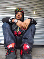
My pictures was a nother things I used to attract my target audience. This picture is of a girl that would be around and about the age of someone who would read this magazine. She in looking up into the light and is relaxed and happy. It is a low-abgle shot so that the readers are not only looking up to her and aspiring to be like but also literally looking up at her
Here I have used artifical light but tried to make it look more natural bymaking the light softer. The light is shining down on her and she is wearing very smart clothes and is sitting in a very dominate position. This is all done to show that she is a 'boss' and is a very powerful woman in the music industry
I also attract my audience with the colours, fonts and layouts used in my magazine. I talk in more detail about these things when I talk about creating and the process of making the magazine.I also go into more detail about the photographs too.


No comments:
Post a Comment